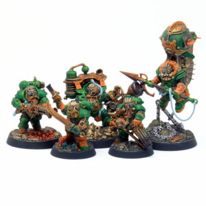
Kharadron dwarves are always a challenge for me as there’s a lot of details on them which on its own is a huge time suck but they can also be tricky to paint well for the table. Detailed models look great up close but if you’re playing with them those details can get a bit lost from a few feet away on the table. So that was a big consideration in coming up with this color scheme – reducing it to largely greens and oranges breaks the models up into easily digestible visual chunks, and the pops of blue and red and gold keep it from being too simple. But I also wanted to play around with contrast colors on top of metallics.
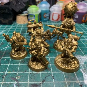
I started off by priming with the good old rattlecan of Retributor Armor.
Even though they’re push together models I used plastic cement to assemble them and gap filled some of the worst seams – these are pretty firmly in the tabletop level of paint job but seams do not mix well with contrast paints. I’ve been using the AK Interactive modeling putty over green stuff lately, as it’s water based and much easier to work with. It also comes in a tube so it doesn’t get all dried out. I did leave a couple of the backpacks off as well as the fin on the balloon guy.
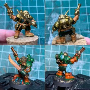
Now for recipes. The metallic green is contrast Warp Lightning. I found out that I did not like the way it laid down on top of the Retributor Gold. I really wanted more of the yellow to come through but instead it was just kind of dull and patchy. So what I ended up doing is putting a coat of contrast Plaguebearer Flesh underneath, which you can see in the top quadrants of the above photo. It gives a very yellow hue to the gold without noticeably making it less metallic.
The green cloth is 2 coats of Castellan Green with contrast Creed Camo on top. I’ve done a similar color before, using washes of Athonian Camoshade and Coelia Greenshade.
The orange leather is 2 coats of Jokaero Orange with contrast Gryph-Hound Orange on top. I don’t really have a comparable non contrast solution for this one as oranges are kind of horrible to work with.
The weapons and non green areas of the backpack got an overall coat of contrast Basilicanum Grey, which has pretty much replaced Nuln Oil for me at this point. It’s much easier to work with and dries faster. Then on areas like the sword above I did a layer of the Gryph-Hound Orange. Because I was using contrast paints some natural edge highlighting did develop but I also did supplement it here and there with VMC Brass (you could probably also use Retributor Gold, I just prefer Vallejo metallics so that’s what I have on hand).
The bases on the models were done with a layer of contrast Black Templar – I liked the idea of the ground being some sort of granite that just has a ton of mica in it or something. The crystals were done with contrast Blood Angels Red and Talassar Blue.
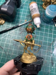
Hopping back to balloon guy, you can see the difference between the gold with the grey contrast on it vs without. The orange on the balloon does not have the grey underneath so it looks much brighter. I also did use a bit of contrast Shyish Purple on the balloon around the edges of the green panels because they are large and needed a bit more shading.
That’s pretty much it for these guys, the blues are nothing special. I did start out putting down a base of Grey Seer with contrast Aethermatic Blue on top but since I was using it on tubing and ropes and stuff I didn’t really like the way it turned out and painted on top of that anyway. The same goes for the plasma coils, I tried it out and didn’t like it and ended up painting it the regular way. The muzzle burn effect I did do with contrast paints – it’s a mix of Talassar Blue and Shyish Purple with a very tiny amount of Blood Angels Red, all mixed while wet.
Thanks for reading and if you have any questions or feedback, please feel free to send it my way, this is just my way of trying to put something back into the community I get so much out of.

0 thoughts on “Thundrik’s Profiteers”