This is going to be more of a quick run through of how I came up with the color scheme and implemented it than a detailed step by step how to. This is in part because I chose to do NMM, more for the sake of practice than it being integral to the look, and there are plenty of NMM tutorials already out there and if I ever was going to write one it wouldn’t be with these models. That being said, if anyone has specific questions about it I’ll do my best to answer.
I actually ended up using contrast paints a lot to get this look, for the skin, the fabric and the leather. I know they’re still controversial to some people and while I’m sure you could replicate this look with regular paints, I wanted this paint scheme to be more evocative than precise so having it be a bit blotchy was a plus for me.
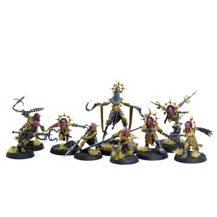
With the color scheme, I actually like the studio paint a lot but they seemed a bit pasty to me which isn’t terribly interesting to paint. People had started painting this warband as being skinned, just all muscle and bone which was cool but I didn’t want to just copy that so I landed on green. It’s visually interesting plus I liked the idea that whatever they’re doing to themselves, they’ve gone off a bit, not necessarily into zombie territory or anything but clearly unwell and maybe a bit of putrefaction setting in. So with that as the base, I decided to keep the masks and armor red-ish because it ties back into the studio scheme and also plays nicely off the green, but bumped up the saturation a bit so it’s more of a magenta. The clothes are also a riff on the studio colors, with more saturation – originally greyish, so I bumped that up with blues and purples. The rest of the leather I kept warm browns as a contrast to all the cool colors and it also really highlights that the strips hanging from their belts are just skinned arms complete with hands. The last big consideration was the metallics – I like the contrast of warm and cool metals and thought gold would be particularly striking on these against all the cool colors.
So to start with, I primed with Grey Seer. It does make a fairly big difference what color you prime with as I found out the hard way – I primed half of this box at a time and the second batch I accidentally used Wraithbone instead. I used two coats of Plaguebearer Flesh as the base for the skintone and it’s a nice medium dark green on top of the Grey Seer. It is very pale and much more yellow on top of Wraithbone. I then used a 50/50 mix of Bugman’s Glow and Cadian Fleshtone on top of knees, elbows, shoulders, knuckles, raised scars, etc so the skintone wasn’t just straight green, but still flushed where a more regular skintone would be.
Because this was a more experimental paint scheme, in some cases I did the process outlined above for the skin, sometimes I ‘sandwiched’ the peach skintones in between the two layers of contrast paint so it all blended together a bit, and in some cases I ended up having to use a thin layer of Militarum Green over it all because I’d screwed up with the primer. I’d say the sandwiching method works best if you want things a bit more blended, but doing the peach skin tones on top isn’t terrible and really kind of fades into the green anyway as the colors play together quite nicely.
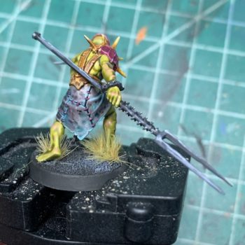
The (leather?)clothing ended up just happening through messing around with contrast paint. I’d done Magos Purple on top of Basilicanum Grey before and really liked the results and that was what I’d started with but ended up not liking it with the green. It just felt unfinished and unsaturated in comparison, so I threw some Aethermatic Blue on top of the mix and that ended up working. So the process, such as it is: one thin layer of Basilicanum Grey, one slightly heavier layer of Magos Purple, so that it pools a bit and you get irregular patches, then a ridiculously heavy handed layer of Aethermatic Blue, for more random pooling. Contrast paints can get a bit goopy if too concentrated so watch out for that, but in this case I really wanted some pooling and splotching so the cloth ended up looking worn in a bit.

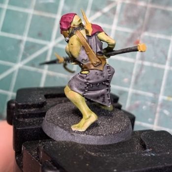
The picture above is just the grey, some of the peaches added on the skin, but needs a second layer of Plaguebearer, and the leather straps blocked in with Snakebite Leather. So with the cloth, once that’s all dry, I went back over and did some chunky blue highlights with Baharroth Blue. It’s not an exact match for Aethermatic Blue but is in the same neighborhood and works decently enough with it when it’s diluted a bit.

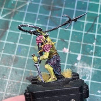
This is the end result, here’s some of the leather weathering as well in this shot. The leather is pretty simple, just the one layer of Snakebite, then I mixed Balor Brown and Ushabti Bone 50/50 and thinned it quite a bit then just added a bunch of thin lines.
Now for the magenta stitching and armor. The stitching is just straight Screamer Pink, and two coats of it are also the base for the armor.

Next, I mixed a very small amount of black into the Screamer Pink, then diluted it into a wash consistency then very carefully loaded up a brush with it and very gently dripped it into each of the recessed areas of the armor. It leaves hard outlines and may end up a bit darker than you want at this stage. The next stage is highlights though, just a bit of white mixed into the pink, then tracing all the raised edges. It should look a bit harsh/too light at this stage. The final step is to glaze with a layer of Screamer Pink and this should blend everything together, taking the harsh edges off the highlights and shading.
And that’s pretty much it for these, it’s really not a lot of colors and the contrast paints do a lot of the heavy lifting.


0 thoughts on “Warcry – The Unmade”