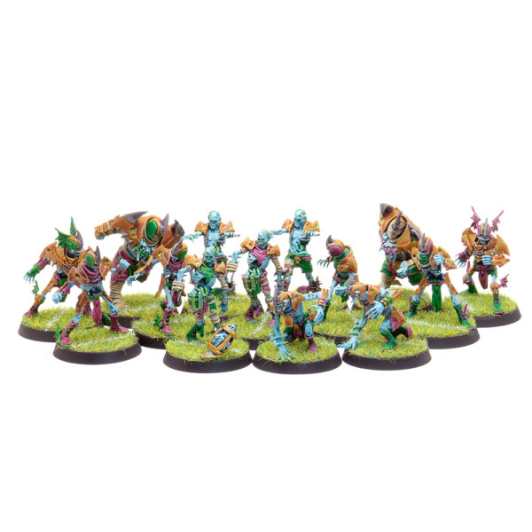
Because swatching is for the weak I decided to just go ahead and paint up a Bloodbowl team to test out the contrast paints. My current thoughts on contrast paints:
- One of the biggest advantages of the paints to me is being able to use them right out of the pot. It’s a small thing but to me it adds up to a lot of saved time because I can just crack open the color I want and slap the paint on.
- They do require more effort as far as prepping your models for paint goes: I’m used to leaving smallish gaps because regular paint works well enough as a gap filler, surface leveler and hider of many small sins. Contrast paint will highlight every flaw on the model’s surface.
- They dry faster than you think they do. In my experience they have less working time than the regular GW washes do and because of the medium they use they can get goopy and you can end up dragging chunks of paint across the model. It’s not a problem with smaller areas, but it can make larger areas tricky. What worked best for me on larger areas was working from the outside in, in a circle, keeping the ‘live edges’ between painted and unpainted areas wet with paint.
- Surface tension. You can put these paints on pretty thick before the paint just starts going everywhere, but painting border edges of areas and working your way inwards helps a lot if you’re trying to keep your edges tidy.
- They are awesome for glazing, again straight out of the pot (assuming you’re not just slopping it on). The amount of pigment + the consistency of paint is incredibly useful for blending colors together quickly.
- The new primer sprays are also available in pots and it’s really the only way to get a clean paint job in my opinion. It makes stray marks much less stressful to deal with.
And now for this particular paint scheme. I chose Aethermatic Blue as the main color I wanted to use because I really like that shade of blue and before contrast paints there was no real easy way to go about achieving it.
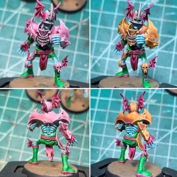
The other colors I ended up using were Volupus Pink, Warp Lightning, Basilicanum Grey (I think it looks really nice as a substitute for metallics), and Skeleton Horde for all the bandages. The above pictures are all contrast on the left side, and the right side is with some additional non-contrast paints. The pink on the armor is actually Magos Purple, another contrast paint that I originally thought would go well with the others and it did not. A wash of Casandora Yellow turned it a nice golden color with purplish undertones. It’s something that might also be achieved using one of the yellow or orange contrast paints but what I like about this particular combination is those undertones and the fact that the highlights are now tinted a vibrant yellow.
I’d say one of my most major concerns about using contrast paints is that while they’re great at giving you a good range of values with one coat, the colors are going to tend towards being flat. Granted this also happens with regular paints if someone only adds white to get highlights and black for shadows. That being said because the contrast paints blend in over other colors so nicely the purple is pretty much perfect for shadows.
As far as highlights go, on these models I ended up using Moot Green as a highlight for both the Warpstone Lightning and the Aethermatic Blue (I tend to highlight with yellow, yellow+ blue = green so in this case it was going to go green on me anyway). The really cool thing about doing highlights on contrast paints, and really one of my favorite ‘features’ of contrast paints is this: because of the nature of the paint, the highlights are already marked out for you, so all you need is a really thin layer of your highlight color to tint that area and it blends in so incredibly smooth.
And that’s pretty much it for these guys, despite the initial learning curve I do think the contrast paints saved me some time and the results are more than good enough to play with.


0 thoughts on “Blood Bowl & Contrast Paints”